Oranj is a white-label product used by financial advisors to keep their clients connected and better informed on their finances. Their product lives somewhere between a financial advisor and a "robo-advisor." I was tasked with redesigning the look and feel of the Oranj platform.
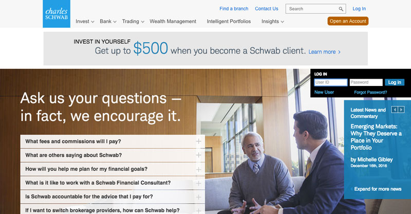
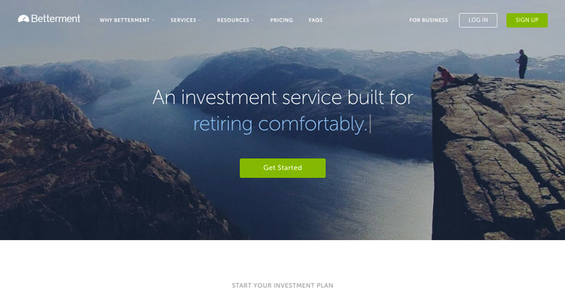
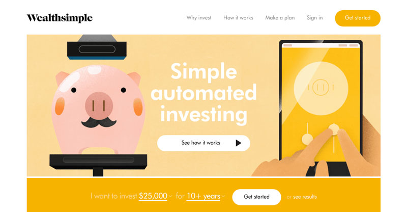
There is a wide variety of competition in the financial advisor space. Companies like Charles Schwab have been established in the field for years, and are well known by customers. They like to ensure that all of the customers questions are answered through a heavy use of text, but sometimes this can make their pages look cluttered. Newer companies such as Betterment and Wealthsimple, have a cleaner more open layout. Most companies in the space primarily use blue and green for their branding, but Wealthsimple takes a different approach in an attempt to stand out by utilizing yellow. Unfortunately the client wasn't able to provide me access to any of the competitions products, so I focused on the marketing pages of the competition to understand their brand.
I met with the client to discuss how they feel Oranj should be portrayed. Overall the look and feel should be clean and professional, but should also seem friendly and even human. Taking this feedback and the competitive analysis into account, I created moodboards and style tiles with those parameters in mind. The client chose two styles on both ends of the spectrum for me to use in the design.
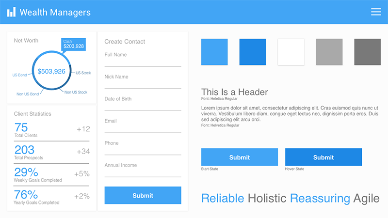
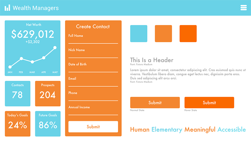
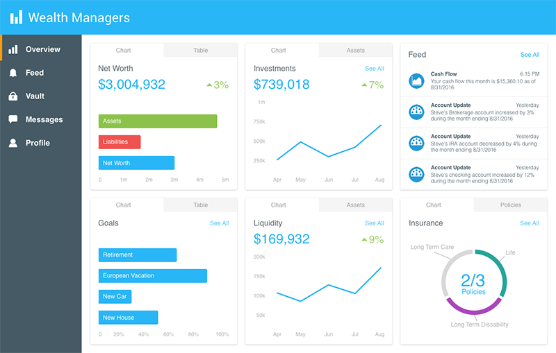
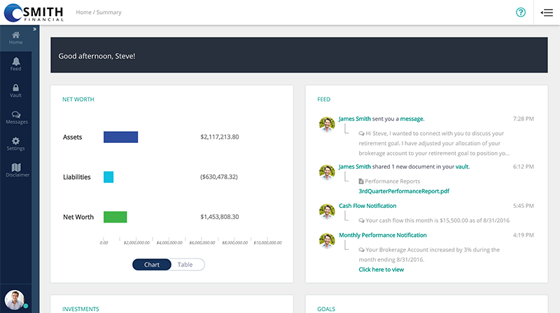
In my initial designs I wanted to clean up the clunky look and feel of the product, by better utilizing some of the wasted space. I eliminated some of the wasted space by creating a third column. I also made the charts look friendlier and easier to digest, having them focus on the most important information. The friendly colors were utilized to give the product a more human feel, but upon testing with users, the colors were found to be a bit distracting.
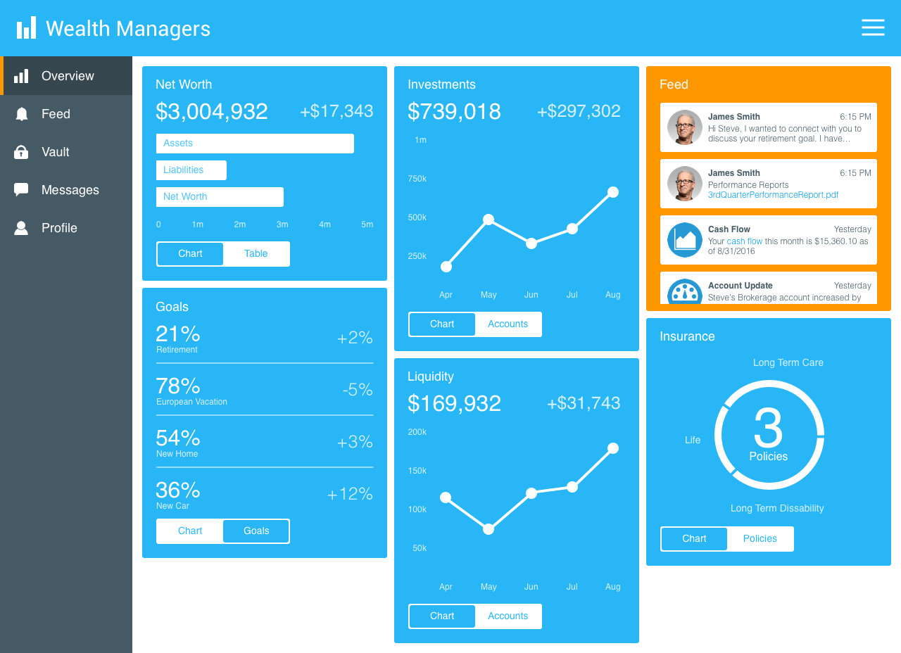
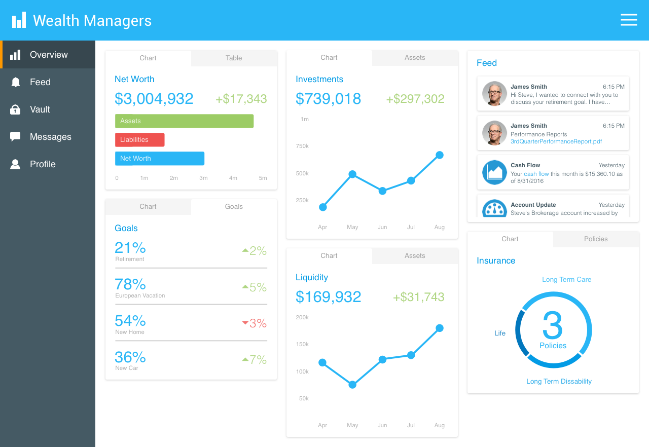
After some revision from user feedback, I used the friendly colors more as accent colors. I also added tabs to the cards for a more detailed view. Green and red were used to easily indicate positive and negative values to the user.
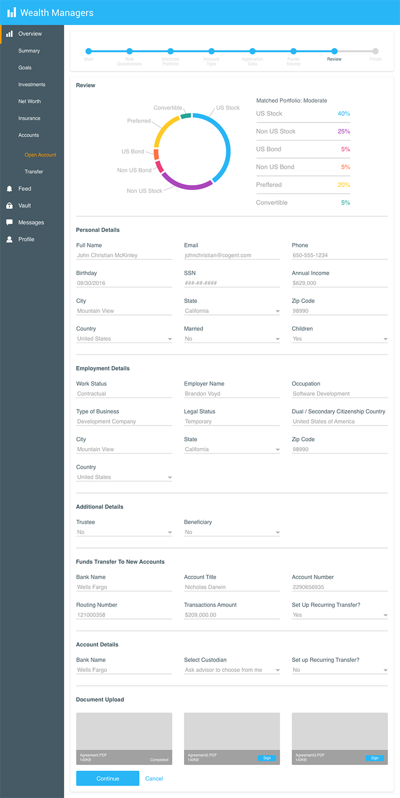
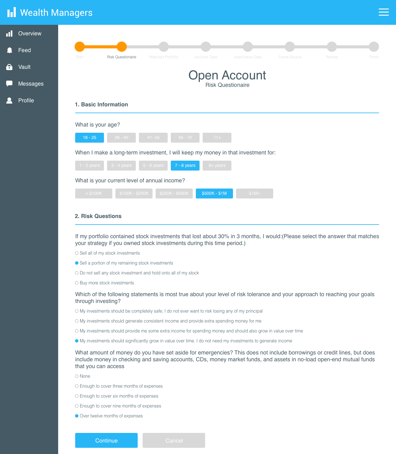
I adjusted the form to give it a cleaner, less overwhelming look. For questions with short answers I changed radio buttons to a line of regular buttons to increase readability. I also adjusted the navigation at the top of the page to make it easier for users to know where they are at in the process.
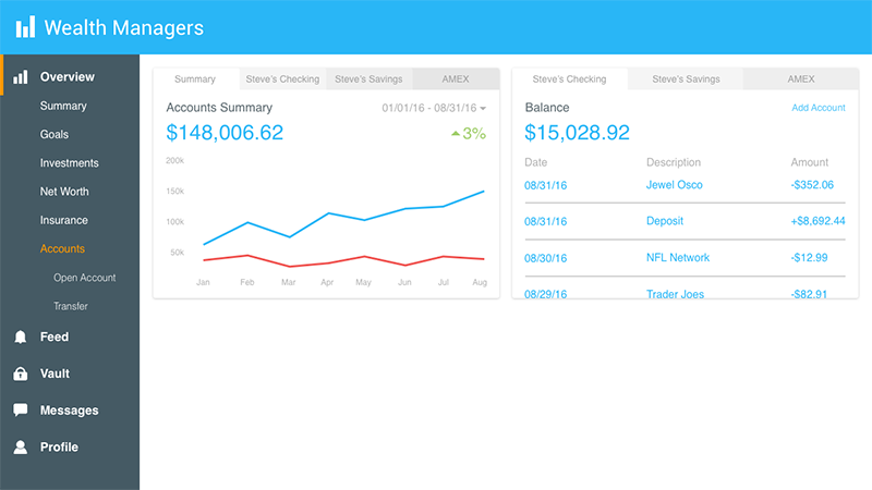
After multiple iterations utilizing client and user feedback, I had my final designs. The cards were changed to be a standard height, giving them a more organized and less cluttered look. The hamburger menu with action items was moved into the left menu. The overall app has that clean look and feel that the client desired with a friendly interface.