4C Scope
Unifying Cross-Channel Advertising for Seamless Campaign Management
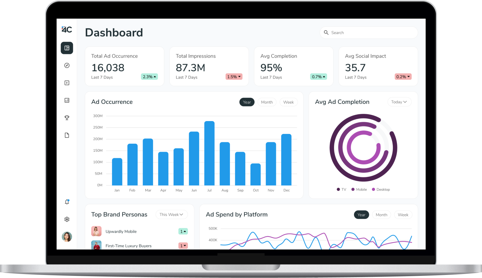
Unifying Cross-Channel Advertising for Seamless Campaign Management

Marketers struggle to manage, execute, and measure campaigns effectively across multiple channels and platforms, lacking a unified solution.
To create a comprehensive platform that enables marketers to seamlessly manage cross-channel campaigns, gain audience insights, and measure performance in one place.
UX Researcher, UI/UX Designer
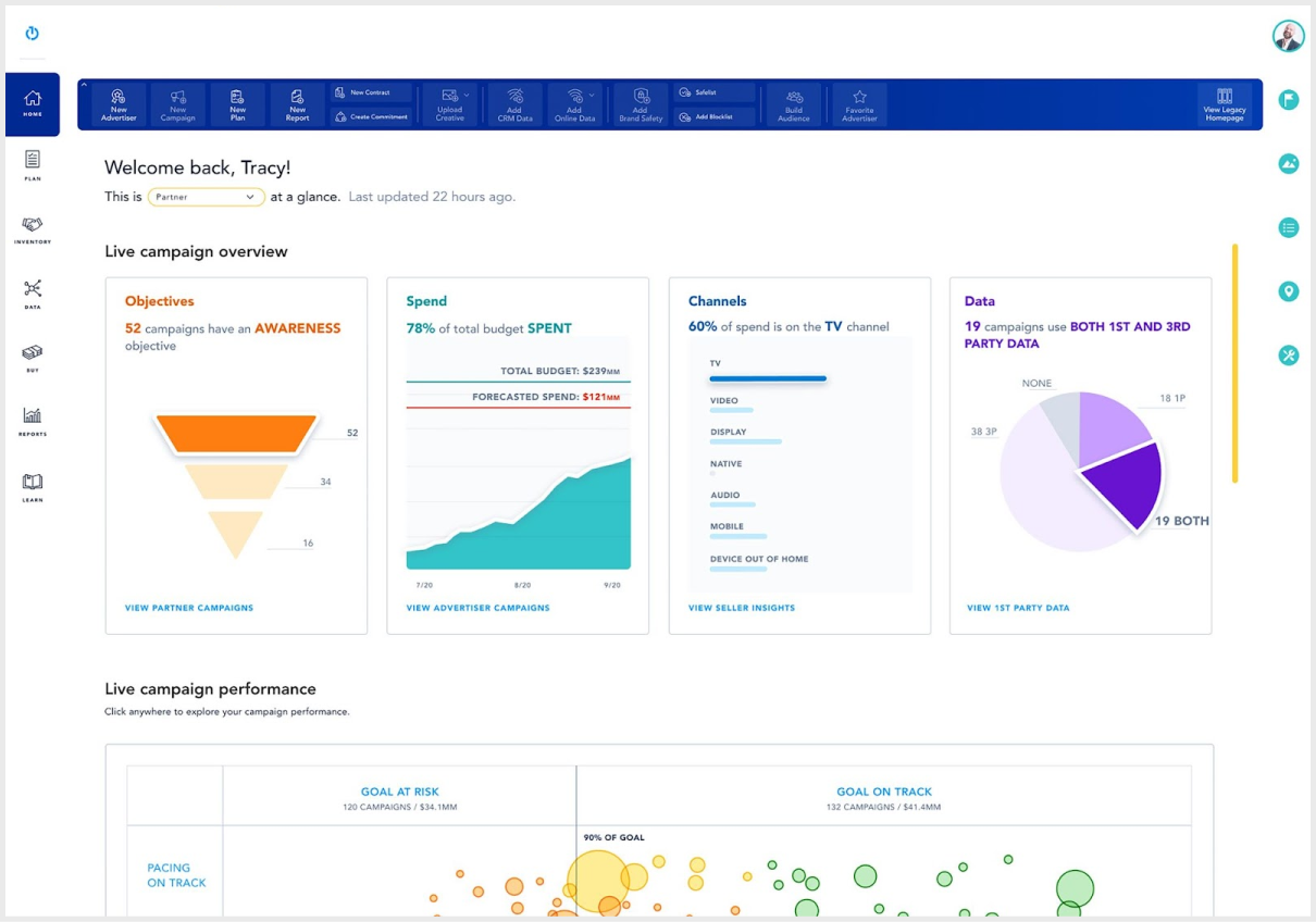
Skip to DesignsIn this phase, I conducted a thorough audit of the existing platform to identify pain points and usability issues. By analyzing user feedback, internal stakeholder input, and usage data, I pinpointed areas where users struggled with navigation, data visualization, and cross-channel integration. The audit revealed opportunities to simplify workflows, improve data accessibility, and enhance the overall user experience. Key insights included the need for a more intuitive layout and better clarity in visualizing complex data across multiple channels.
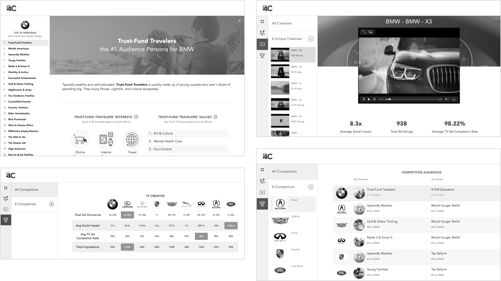
To ensure the platform met industry standards and provided unique value, I conducted a competitive analysis of similar tools in the market. I reviewed key competitors that offered cross-channel advertising and campaign management platforms, focusing on their strengths and weaknesses. The analysis revealed several best practices, such as advanced data segmentation, intuitive dashboard designs, and seamless integration of marketing channels. However, it also highlighted gaps in user experience, such as overly complex workflows and limited cross-platform insights. This information guided my redesign, allowing me to leverage industry trends while addressing the unique needs of our target users, ensuring our platform stood out by offering a more user-friendly and efficient solution.
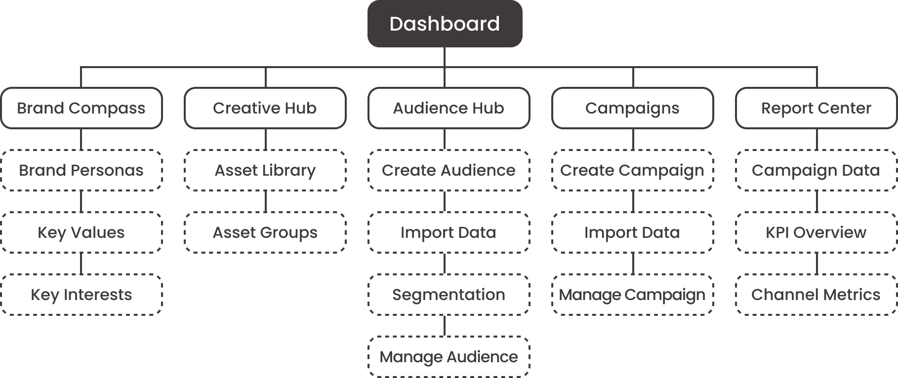
The existing information architecture was fragmented, making it challenging for users to navigate through the various tools and insights. I reorganized the structure to create a more intuitive flow, grouping related tools and features into logical categories. The new architecture prioritized user needs and tasks, ensuring that critical functionalities were easily accessible. By simplifying the hierarchy and improving labeling, the redesign aimed to reduce cognitive load and make the platform more user-friendly.
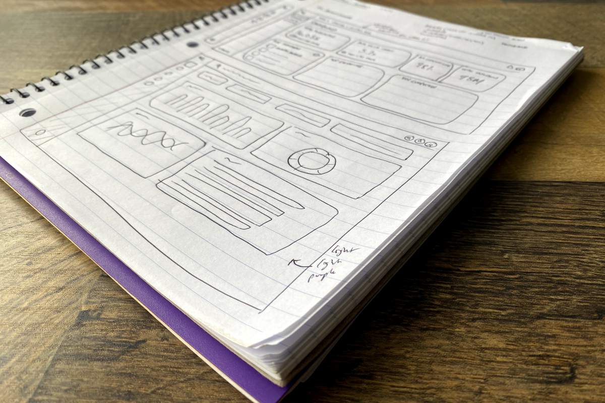
The design process began with hand-drawn sketches to quickly explore different layout ideas and user flows. These sketches provided a rough blueprint for key screens, focusing on optimizing how users interacted with critical modules like Brand Compass and Audience Hub. Once the initial concepts were validated, I translated them into low-fidelity wireframes to visualize the core structure and functionality. The wireframes allowed for early feedback from stakeholders and helped guide the development of the high-fidelity prototype, ensuring that the final design met both user needs and business goals.
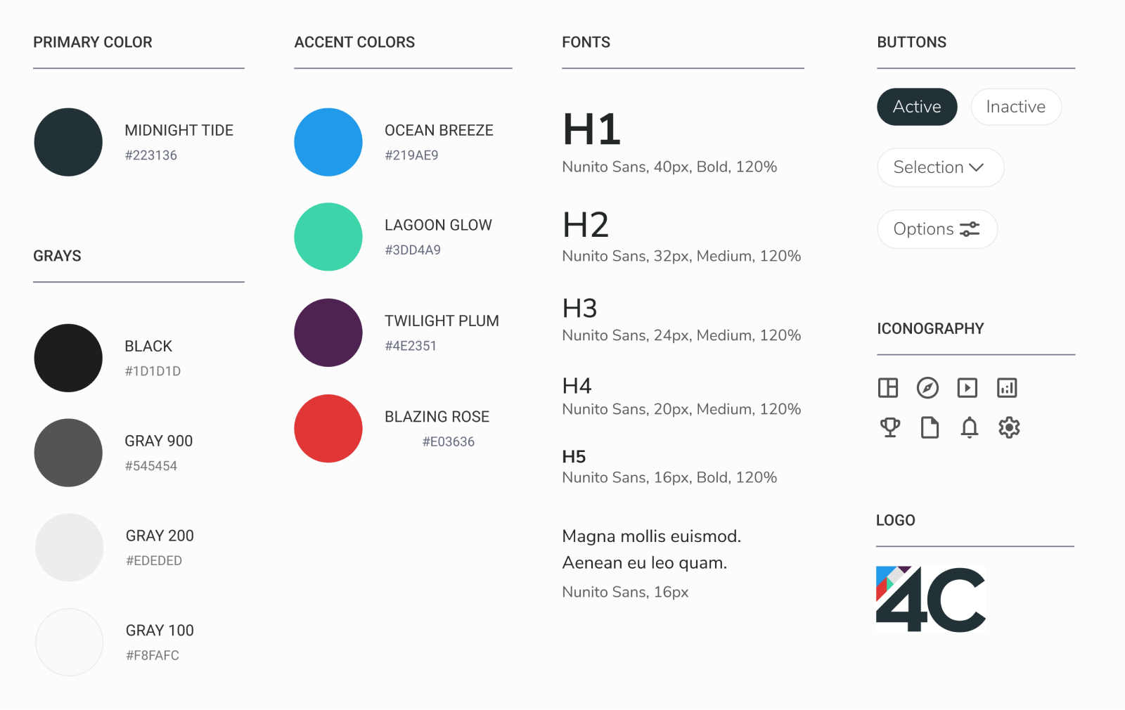
I developed a style guide to ensure consistency in the design across the platform. This guide included color schemes, typography, iconography, and UI elements that aligned with the brand’s identity while ensuring a clean, modern, and user-friendly aesthetic. The style guide emphasized simplicity and clarity, with a focus on visual hierarchy and readability. It also included interactive elements like buttons, dropdowns, and sliders, ensuring they were consistent and easily identifiable throughout the platform.
The redesigned user interface was built around the principles of clarity and usability. I focused on streamlining the dashboard, improving data visualizations, and ensuring seamless navigation across different features. Interactive elements were placed intuitively to guide users through their tasks with minimal effort. The final UI balanced functionality and aesthetics, ensuring that complex data was presented clearly and that users could easily access the tools they needed to manage their campaigns.
This redesign reinforced the importance of simplifying complex workflows and enhancing the clarity of data visualizations. I learned how to create more intuitive user experiences by focusing on the user's goals and pain points. Additionally, the project highlighted the need for consistency across design elements to create a seamless user journey. The redesign ultimately improved user engagement and efficiency, proving that thoughtful, user-centered design can drive better outcomes.
Next
Designing Digital Experiences That Elevate the User Journey
View Case Study
"We are made to persist...that's how we find out who we are."