Livy
Effortless Travel Planning with Personalized AI-Powered Recommendations
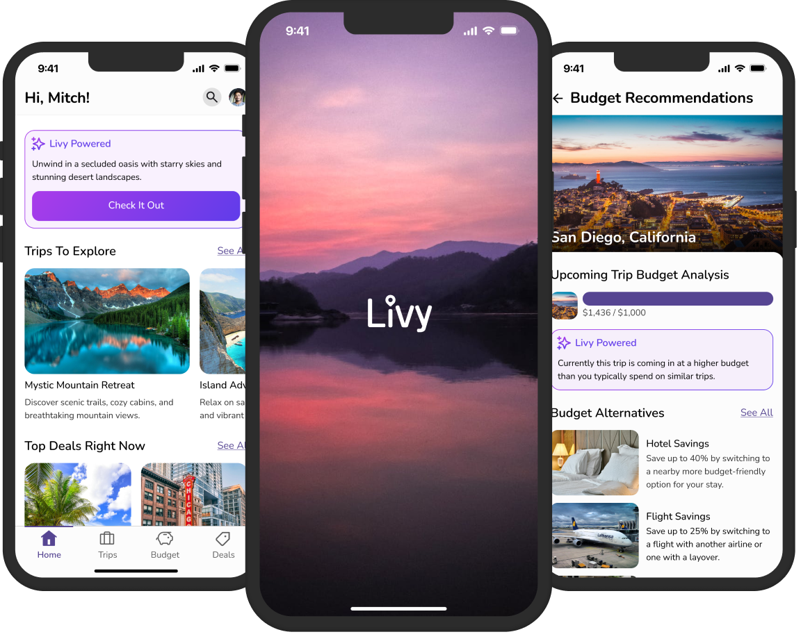
Effortless Travel Planning with Personalized AI-Powered Recommendations

Travel planning can be overwhelming due to the vast number of options, varying costs, and the difficulty of finding experiences tailored to personal preferences. Many travelers struggle to stay within budget while ensuring their trip matches the experience they want.
To create a smart, user-friendly app that provides personalized travel suggestions, budget-friendly recommendations, and curated deals, helping users plan trips effortlessly while staying within their financial limits.
UX Researcher, UI/UX Designer
Skip to DesignsThe secondary research aimed to uncover the primary challenges faced by users in travel planning and the issues they encounter when interacting with AI on digital platforms. Through a thorough analysis of multiple articles, key insights were drawn to inform Livy's design and enhance the user experience.
This secondary research was conducted to understand better the challenges users face when planning trips, especially those trying to balance their budgets and experiences. By analyzing multiple articles, I gained valuable insights into the pain points travelers encounter, allowing us to refine Livy’s features to better address these concerns.
To carry out this process, I analyzed different articles, each providing a unique perspective on the struggles of trip planning. These findings directly informed Livy’s design, helping us focus on simplifying the process and offering solutions that ease the stress of trip planning.I identified recurring themes that shed light on the key obstacles users face.
Three key takeaways from the articles included:
• Travelers struggle to balance their budgets while still seeking meaningful experiences and destinations.
• Stress often arises from trying to create an itinerary that allows for both planned activities and spontaneous moments.
• The pressure to stick to a budget while navigating options for deals, destinations, and activities can lead to decision fatigue and overwhelm.

This secondary research aimed to explore the challenges users encounter when engaging with AI on web and mobile platforms, especially in areas aligned with Livy's goal of streamlining travel planning. By analyzing multiple articles, I gained valuable insights into common user frustrations and identified how Livy’s AI features could be tailored to address these pain points effectively.
To carry out this process, I reviewed articles focusing on platforms like Netflix, Amazon, and Noom, each offering unique perspectives on AI-driven interactions. These findings directly informed Livy’s design, ensuring its features prioritize user satisfaction, trust, and personalization. I identified recurring themes that highlight critical obstacles users face.
Three key takeaways from the articles included:
• Users often encounter irrelevant recommendations, which fail to match their specific preferences and needs.
• A lack of trust in AI outputs, such as questionable reviews or overly generic feedback, undermines user confidence in the platform.
• Insufficient personalization in interactions leads to frustration and a sense that the AI isn’t adequately addressing individual user situations.
The goal is to understand the specific challenges that travelers have when planning a trip on a budget, including knowing all of the details of what they need to book, when they need to book it, booking in a timely fashion, and how to stay within their budget. Gaining insights into the challenges of these users will provide invaluable information on how to move forward to build solutions that address their travel planning needs.
• What are the main roadblocks users face when trying to stay within their budget while planning a trip?
• What are the most time-consuming and frustrating parts of booking a trip for users?
• What do users currently use to determine all the details that need to be figured out, booked, and planned for a specific trip?
• What struggles have you encountered with Web/Mobile Powered AI?
• What could be better about a Web/Mobile Powered AI to make it easier for everyone to use?
The survey was designed to be completed in 10-15 minutes, ensuring a quick and accessible way to gather valuable insights on users’ travel planning experiences and interactions with AI tools. It was distributed online to a target user group who met the following criteria:
• Individuals who had planned a trip in the past
• Individuals who were currently planning a trip
• Individuals who had contributed to planning a group trip

Theme #1: Usability Challenges
Users often found it difficult to compare prices across platforms and book transportation and accommodations within their budget. Unexpected fees and the challenge of sticking to a meal or activity budget made this task even more difficult. The complexity of balancing different aspects of travel planning, such as accommodations and itineraries, led to increased frustration.
Theme #2: Pain Points
The most significant challenges in staying within a budget were finding affordable accommodations, booking transportation within budget, and dealing with unexpected costs. Users also expressed frustration with the time-consuming nature of researching destinations, creating itineraries, and comparing prices across multiple sources, which added to the complexity of trip planning.
Theme #3: Desired Features
Users expressed a strong desire for tools that could help plan all the details of their trip more seamlessly. Many currently rely on a combination of spreadsheets, online reviews, and forums, but these methods felt inefficient and disorganized. Users wanted a more integrated solution that would streamline their planning process.
Theme #1: Inaccuracy and Relevance of AI Results
A major concern for users was the inaccuracy and lack of relevance in the results provided by AI-powered tools. Many users found the suggestions to be irrelevant, too narrow, or not aligned with their preferences, making it difficult to trust the AI's recommendations.
Theme #2: User Experience and Feature Limitations
Users frequently mentioned the lack of helpful features and difficulties in understanding how to use AI tools effectively. Suggestions for improvement included using more natural language, providing clearer prompt examples, and giving users greater control over the personalization of results to better meet their individual needs.

An empathy map was created from the survey analysis to understand users' emotions, behaviors, and pain points during trip planning with an app. It highlighted users' frustrations with too many options, trust issues, and the need for personalized recommendations. This helped refine the app’s features to focus on simplicity, reliability, and building trust with users for a more effective and emotionally resonant experience.
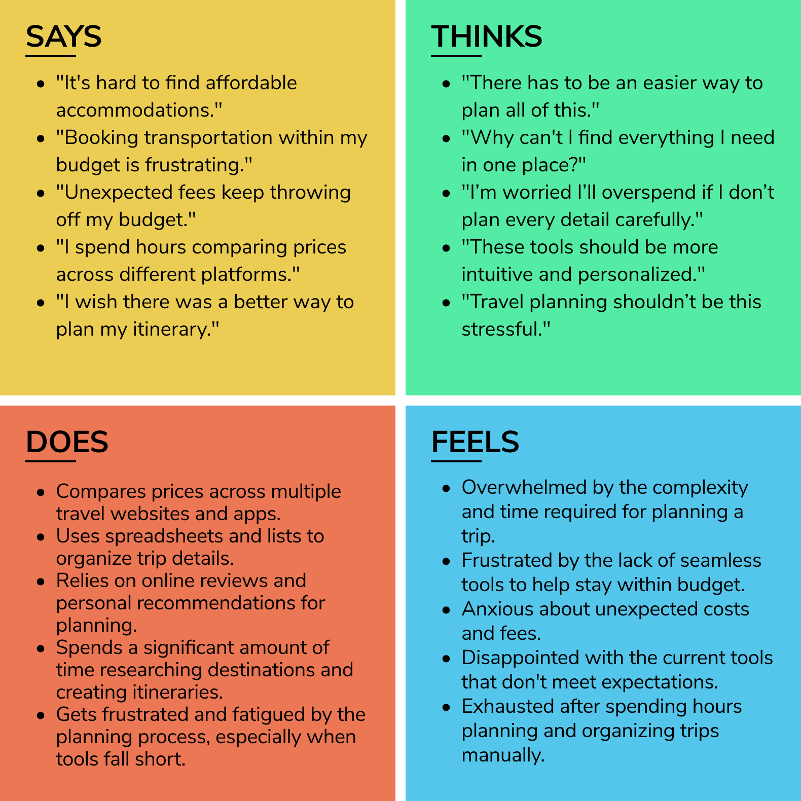
The empathy map was created to visualize insights from the survey analysis, focusing on the needs, frustrations, and expectations of potential users. It helped identify what users think, feel, say, and do when planning trips, especially regarding their interactions with AI tools. This understanding directly influenced the design and features of the AI solution, ensuring it addressed user pain points and aligned with their desires for a personalized, efficient, and trustworthy travel planning experience.
The process of creating the Jobs to Be Done (JTBD) statements allowed me to better understand the specific needs and motivations of users. By breaking down the trip planning process into individual jobs, I was able to highlight the key moments where Livy can add value. This approach clarified what users are trying to achieve in different phases of their trip and ensured the design focused on offering practical solutions. The benefit of this process was creating clear, actionable insights that directly guided feature development. My conclusion was that Livy should focus on simplifying the trip-planning experience, providing users with a comprehensive, budget-friendly, and personalized tool to ensure a stress-free and enjoyable journey.

When I am planning a vacation with limited time, I want to quickly find and book all accommodations, transportation, and excursions all in one place, so I can feel good knowing everything is organized.
When I am trying to plan a trip with a tight budget, I want to compare prices and find good deals for the whole trip, so I can enjoy my vacation without stressing about overspending.
When I am traveling to an unfamiliar destination, I want to get recommendations for things to do that match my interests, so I can feel excited and confident about exploring somewhere new and making the most of it.
Planning a vacation under a tight schedule
The Web/Mobile AI Powered can pull together all the booking options, offer personalized suggestions, and create a shareable itinerary to make planning a breeze and keep everything on track.
Planning a trip within a budget constraint
The Web/Mobile Powered AI can compare prices across various options, highlight deals, and provide a complete breakdown of costs with all additional fees included, helping users stay within their budget and avoid unexpected expenses.
Planning a trip to somewhere that is unfamiliar to them
The Web/Mobile Powered AI can offer customized activity recommendations based on the user’s interests and provide detailed, easy-to-follow information on navigating the destination, helping them feel prepared and enthusiastic about their travel experience.
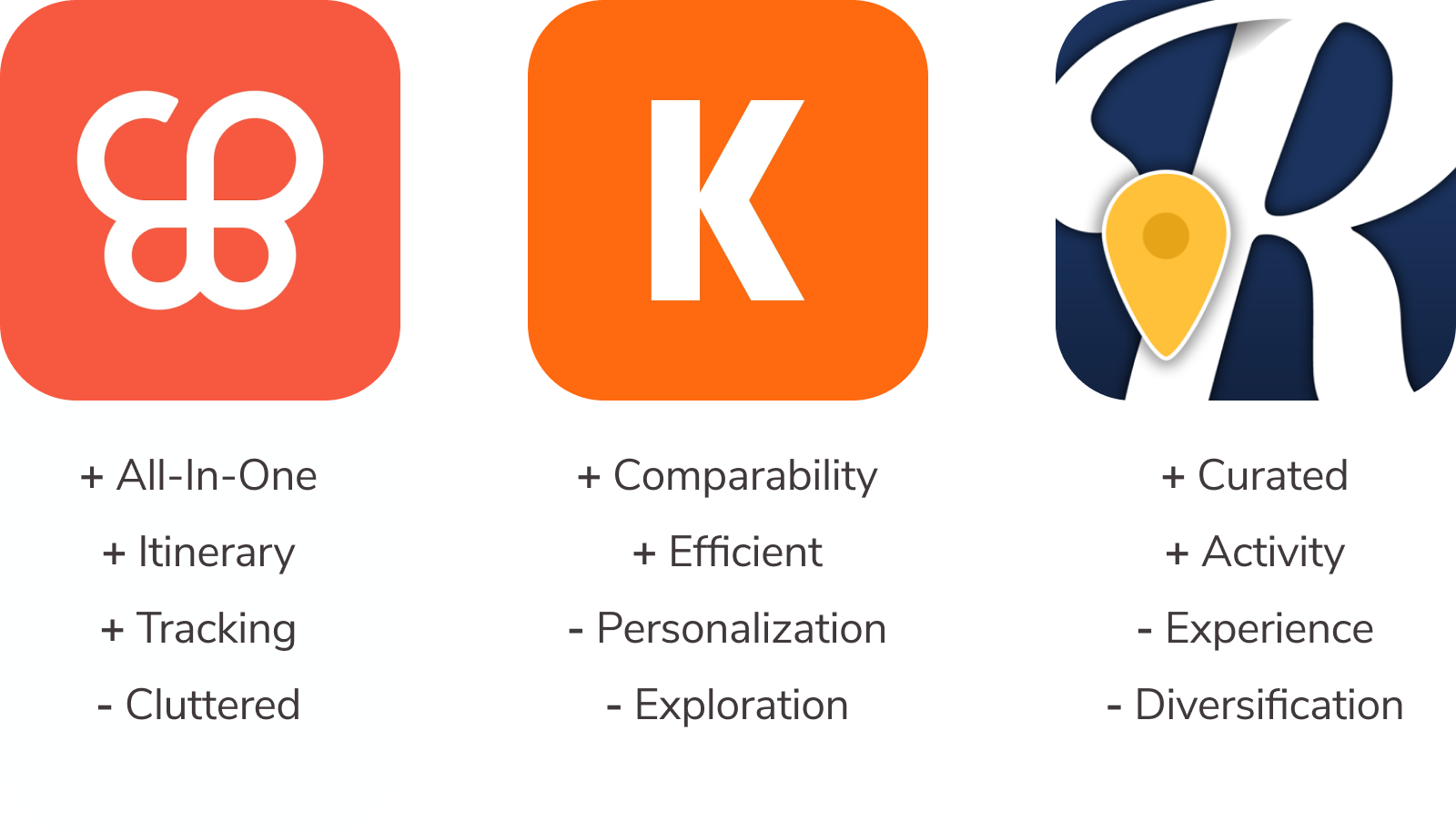
To better understand the travel planning landscape and identify features aligning with Livy’s mission of simplifying trip planning, I analyzed Wanderlog, Kayak, and Roadtrippers. Wanderlog impressed me with its all-in-one trip management, including itinerary building and expense tracking, though it felt cluttered with larger plans. Kayak’s quick comparisons for flights, hotels, and rentals were efficient but lacked personalization and exploration features. Roadtrippers excelled in road trip planning with curated routes and activity suggestions but fell short for users seeking diverse trip types. These insights underscored the importance of balancing usability with personalized travel options for Livy.
The creation of three How Might We (HMW) statements was essential in shaping the direction of the ideation process. These statements were crafted to pinpoint specific user needs and challenges, helping to focus the team's creative energy on finding practical solutions. Each HMW statement served as a foundation for exploring potential AI capabilities that could address users' pain points and enhance their experience. By framing problems in a clear, open-ended way, we encourage innovative thinking and a diverse range of possible solutions. These HMW statements ensured that the ideation process was both targeted and flexible, resulting in well-defined solutions that align with user needs.

HMW Statement:
How might we help users efficiently plan and book accommodations, transportation, and experiences while creating a shareable itinerary when planning a vacation on a tight schedule?
AI Benefit:
A bot could help users achieve their goals more effectively and in less time.
Impact:
AI can streamline the vacation planning process by quickly handling bookings and organizing them into a shareable itinerary, saving time and making the process more efficient.
HMW Statement:
How might we help users efficiently plan and book accommodations, transportation, and experiences while creating a shareable itinerary when planning a vacation on a tight schedule?
AI Benefit:
AI-powered tools analyze large data sets to identify and categorize items, making it easier to compare prices and find the best deals.
Impact:
AI removes the frustration of manually comparing prices, helping users quickly identify the best options that fit their budget and simplifying the planning process.
HMW Statement:
How might we help users navigate new destinations and get personalized recommendations for activities tailored to their preferences and upcoming events, making their trip smoother and more enjoyable?
AI Benefit:
AI that predicts future events can anticipate user needs and suggest activities or tips based on upcoming events.
Impact:
By predicting future events, AI helps users prepare for their trip by recommending relevant activities, reducing stress, and ensuring they get the most out of their experience.
During the ideation phase, several ideas were developed to enhance the user experience by leveraging AI to simplify key aspects of the travel planning process. The concepts focused on providing quick and efficient solutions that saved users time, such as offering personalized recommendations and automating tasks like booking accommodations, transportation, and activities. These ideas aimed to minimize the effort required from users and streamline their planning process.
The ideation also emphasized the importance of AI in personalizing the experience. By using user preferences, budget constraints, and social insights, the AI could offer tailored suggestions that helped users make informed decisions. This approach highlighted the potential of AI to create a seamless and efficient travel planning journey, making it easier for users to navigate unfamiliar destinations and stay within their desired budget.

The purpose of carrying out this process was to identify and prioritize the most critical user stories that directly contribute to the core goals of the travel planning experience: efficiency, budget management, and personalization. By selecting these user stories, I aimed to simplify the process of booking accommodations and transportation, offer personalized activity recommendations, and help users stay within their budget.
These user stories align with the project's goal of creating a seamless, user-friendly experience by prioritizing essential features that save time and reduce stress. By focusing on these key functionalities, the user experience becomes more intuitive, helping users achieve their trip-planning goals with minimal effort and within their desired budget.

As a user, I want to quickly enter my destination and travel dates, so that I can get immediate AI-powered recommendations for accommodations and transportation.
As a user, I want the AI to suggest accommodations and transportation options based on my preferences and past choices so that I don’t have to sift through countless options.
As a user, I want to see a clear visualization of my trip expenses, so that I can track how my budget is being allocated and avoid overspending.
As a user, I want AI to give me recommendations on how to stay within my trip budget so that I can make adjustments to save money where possible.
As a user, I want AI-powered recommendations for activities based on my interests, so that I can enjoy my trip with activities that match my preferences.
The site map was created to organize and structure the user flow of the travel planning app, ensuring clear, intuitive navigation. This activity helped define the information architecture by identifying key features and content areas for easy access. Mapping the screens and their connections clarified how functions like trip planning, budget management, and activity discovery fit into the app, ensuring logical integration of each user story and core function. By visually laying out the architecture, I optimized the flow of information, allowing users to quickly access important features for a seamless, efficient experience.
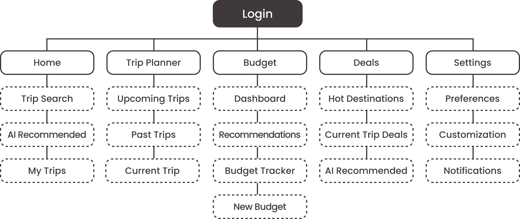
The site map was created to organize and structure the user flow of the travel planning app, ensuring clear, intuitive navigation. This activity helped define the information architecture by identifying key features and content areas for easy access. Mapping the screens and their connections clarified how functions like trip planning, budget management, and activity discovery fit into the app, ensuring logical integration of each user story and core function. By visually laying out the architecture, I optimized the flow of information, allowing users to quickly access important features for a seamless, efficient experience.


Sketching the screens provided valuable insights into the relationship between user needs and the app's functionality. It highlighted how each element of the design contributes to solving the user's problem and ensures the flow between screens feels natural and logical. By visualizing the app layout, it became easier to identify potential pain points, optimize navigation, and prioritize clarity and usability in the design.
Ensuring consistency across actions, screens, and objectives emphasized the importance of a seamless user experience. This alignment helps users achieve their goals effortlessly while enjoying an intuitive and cohesive journey throughout the app.
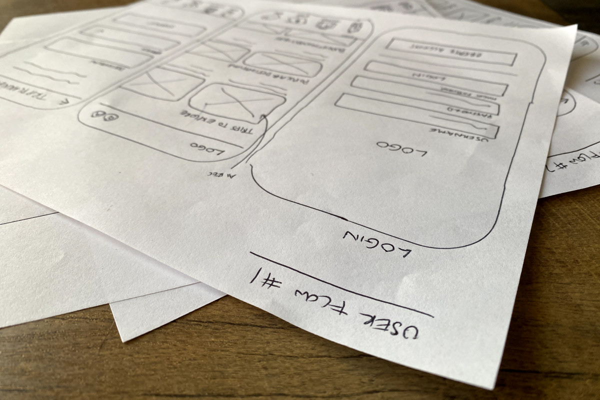
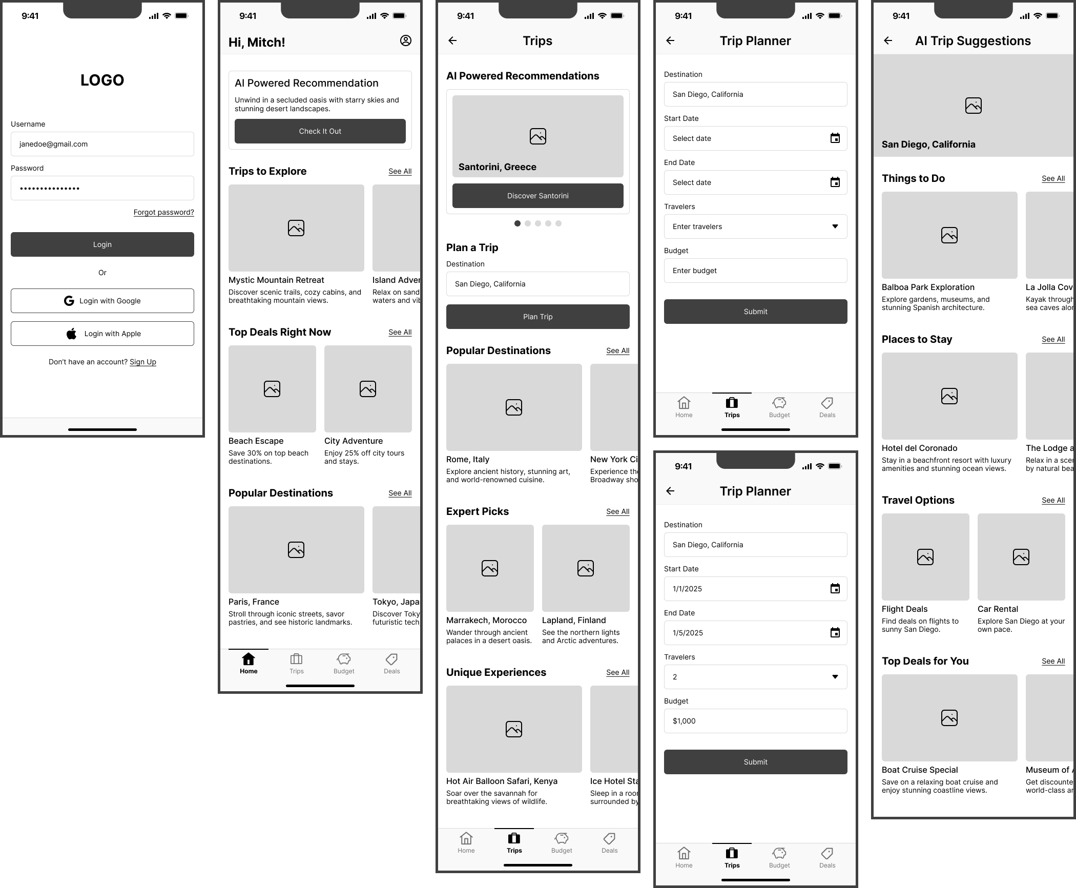
The wireframing process is crucial because it serves as the foundation for a well-organized, intuitive, and effective user experience. It allowed me to visualize the app’s structure and flow before diving into more detailed design work, ensuring that the user’s needs and journey are prioritized. Lo-Fi wireframes help identify the basic layout and functionality early on, and Med-Fi wireframes refine this with more specific design elements, ensuring that the interface is intuitive and easy to navigate.
In this project, the user experience emphasized streamlining navigation and clarity in key actions like entering travel preferences, exploring recommendations, and managing budgets. The shift from Lo-Fi to Med-Fi wireframes included greater visual refinement and interaction specificity, making it easier to identify usability issues and validate design decisions, ultimately paving the way for a seamless, user-centered experience.
The inspiration behind Livy’s look and feel stemmed from its core identity as a fun and reliable travel companion, balancing adventure with accessibility to ensure the app feels both exciting and easy to use. A color palette of purples and bluish-greens was chosen to convey a mix of tech-savvy intuition and budget-friendly travel vibes, with purple highlighting Livy’s AI-driven intelligence and bluish-greens evoking exploration and flexibility. The UI design emphasizes a welcoming, user-friendly experience through minimal layouts, rounded edges, and spacious design, avoiding clutter and enabling users to focus on their travel plans effortlessly. Engaging imagery and bold color contrast enhance the interface, capturing the excitement of travel while guiding users seamlessly through the app’s features, creating a cohesive visual style that supports Livy’s mission of making travel planning effortless and enjoyable.
The style guide for Livy was developed to ensure a cohesive and functional design system. For the font, I selected Nunito because it has a smooth, rounded, and modern tech feel, which aligns perfectly with Livy’s user-friendly and approachable brand personality. Nunito's clear, clean lines help create a legible and intuitive interface, making it easier for users to interact with the app, especially when navigating complex trip planning details.
Regarding the color palette, I chose a combination of purple and bluish greens. Purple was selected to represent Livy’s innovative and intuitive tech capabilities, as it evokes a sense of creativity and sophistication while maintaining approachability. The bluish greens were chosen to evoke a sense of travel and exploration, with a flexible, budget-friendly edge. The cool tones suggest calmness, reliability, and trustworthiness, key characteristics of a travel companion app. Together, these colors symbolize a blend of adventure and smart, technology-driven solutions, ensuring the design appeals to users while reinforcing the brand’s identity.
At the Hi-Fi screen stage, I added visual refinements, including detailed UI elements like icons and buttons, making the design closer to the final product. The font, Nunito, and color palette were applied, enhancing readability and consistency across screens.
Additionally, I refined content placement and ensured a smooth information hierarchy, aligning with the user flow for better navigation. Consistency in design components from the style guide was prioritized, improving the overall visual harmony. This stage allowed for more effective upcoming usability testing, helping me identify potential issues and ensuring the design was both functional and user-friendly.
The purpose of creating the prototype was to bring the app's design to life in an interactive form, allowing for hands-on testing and validation of user flows and interactions. Built using Figma, the prototype helped visualize how users would navigate the app, ensuring that the design was intuitive and met their needs. I learned a lot from the prototyping process, especially how important it is to test iteratively. It helped me spot areas where I could simplify interactions and make navigation smoother. One of the biggest challenges was making sure the prototype captured all the complex features without making things feel cluttered or hard to use. These were addressed by refining the user flow, simplifying certain interactions, and making adjustments based on user feedback, ultimately enhancing the app’s overall usability and ensuring it was aligned with user expectations.
I carried out usability testing to ensure that Livy effectively met users' needs and provided a smooth trip-planning experience. I conducted remote testing using Zoom, where five users tested the Figma prototype. To identify usability issues, gather valuable feedback, and refine the overall user experience, participants were tasked with completing specific actions during the testing process.
User Task #1:
Get AI Travel Suggestions for a specific date range and destination
User Task #2:
Get Budget-Friendly Travel Recommendations to stay within my trip budget
User Task #3:
Explore Personalized Deal Suggestions
The usability testing revealed several areas where Livy’s design needed improvement to enhance its usability and better meet user expectations. Based on the findings, I made several key changes to the design.
Issue:
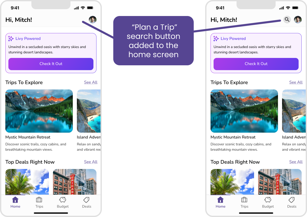
“Plan a Trip” Search Button Missing on the Home Screen
Before:
The home screen lacked a visible “Plan a Trip” search button, making it difficult for users to locate and initiate the trip-planning feature. Participants in usability testing expressed frustration and confusion as they expected this functionality to be prominently displayed on the homepage.
After:
A prominent “Plan a Trip” search button was added to the home screen, improving accessibility and aligning with user expectations. This change made it easier for users to start planning their trips and ensured the feature was immediately discoverable.
Issue:
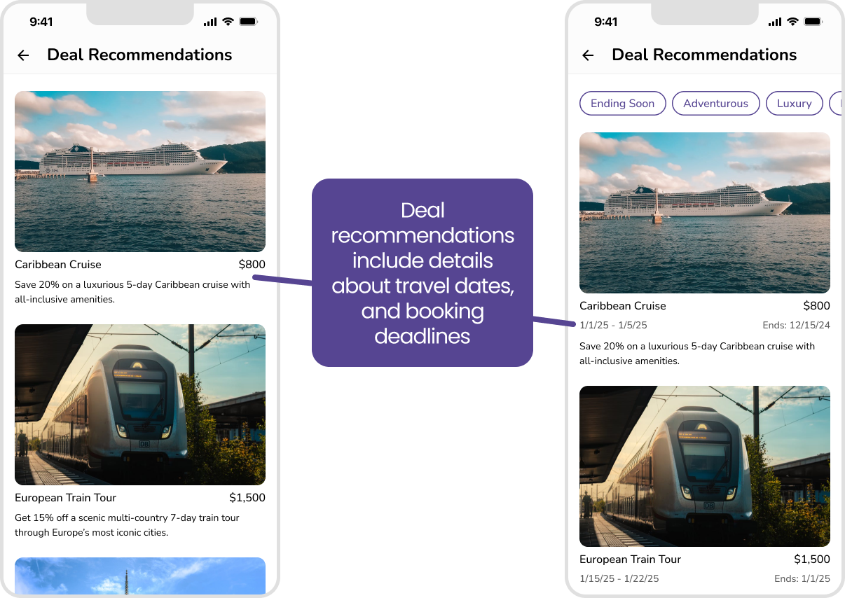
Lack of Deal-Specific Dates and Restrictions
Before:
Deal recommendations were missing critical information, such as applicable travel dates and booking deadlines. This lack of clarity frustrated users, who felt unable to make informed decisions and often questioned the relevance of the deals presented.
After:
Deal recommendations now include clear details about travel dates, and booking deadlines. This update helps users make more informed decisions and ensures greater transparency, reducing confusion and enhancing the overall experience.
Issue:
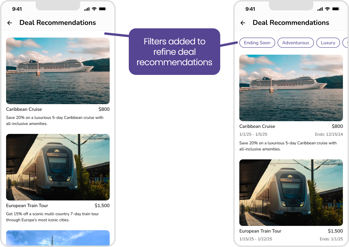
No Search Filters for Deal Recommendations
Before:
Users had difficulty finding relevant deals because there were no filters to refine the recommendations based on their specific preferences, such as trip type, and deals ending soon. This lack of filtering options led to frustration and inefficient browsing.
After:
A set of filters was introduced, allowing users to refine deal recommendations by trip type and deals ending soon. This improvement enables users to quickly find deals that match their criteria, significantly enhancing the app’s usability and efficiency.
This project provided valuable insights into designing for AI applications, especially in balancing technology with user-centric design. One of the main takeaways was how crucial it is to ensure simplicity and accessibility in AI-driven apps. Usability testing revealed issues like the difficulty users faced in finding core features and understanding deal recommendations, leading to adjustments like adding a visible "Plan a Trip" button and implementing filtering options for deals. The iterative process of testing and refining made the design more intuitive and user-friendly.
Through this case study, I gained a deeper understanding of how to create seamless interactions between AI and users, ensuring the technology feels helpful rather than overwhelming. The challenge of integrating AI in a way that’s both smart and simple was rewarding, and I now have a stronger grasp on how to design AI-based interfaces that feel natural and empowering for users.
"We are made to persist...that's how we find out who we are."